The Form instruction type allows users to select from either a predefined list of answers or enter free text to answer a question or provide information. The varied uses of a Form instruction make it somewhat different than the Text instruction. Form and Text instructions can be used in conjunction with each other to create robust, multipurpose content. Form instruction frames must be added and formatted from the Content Editor page.
1.In the Content Editor, click the FORM button at the top of the Instruction list panel.
 The new Form instruction frame will be inserted after the active frame in the Instruction list panel.
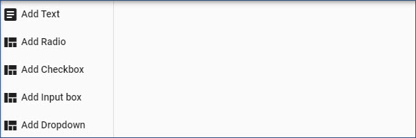
2.The Form Editor pane (as shown in the graphic) provides several types of controls used to build the Form instruction frame:
•Add Text. Used for question or statement text.
•Add Radio. Used for multiple choice, single answer responses.
•Add Checkbox. Used for true/false, yes/no, or multiple choice, multiple answer responses.
•Add Input box. Used for users to provide free-form responses. This control could also be used to gather information, such as user name or email address.
•Add Dropdown. Used to provide a pre-populated list of items from which users can select. For example, selecting a location.
3.For each control, once added, the Move (domino), Delete (trash can), and Edit (pencil) icons display to the left of each inserted control.
This field displays the Form Text Editor dialog box, which is used to enter and format informational text to the user. In Assessment content, use the Add Text control to type the question. The Form Text Editor dialog box is a combination of the Edit pane for Text instruction frames and the Resources tab in order to add graphics or screen shots. (See the Formatting Toolbar and Resources Tab topics.) 1.Click the Add Text button. 2.In the Form Text Editor dialog box, enter and format text. 3.If appropriate, insert Resources (e.g., graphics or screen shots). 4.Click the Save button to save and close the dialog box.
|
The Radio control is used to insert radio buttons for true/false, yes/no, and multiple-choice, single answer responses. 1.Click the Add Radio button. 2.Complete the Form Item: Radio dialog box. •The Default Font, Default Font Size, and Text Color fields are automatically set based on the Content Properties for the content file (Content Settings icon in the Navigation bar). If appropriate, change each setting as required. 3.In the Option Label field, type the first possible response. 4.Click the + button to add the response. 5.The Preview area shows the added response. Use the Move (domino) or Delete (trash can) icons to manage the added responses. 6.Repeat Steps 3 through 5 for each response to be added to the Form instruction frame. 7.Click the Save button to save the and close the dialog box.
|
The Checkbox control is used to insert check boxes for multiple-choice, multiple answer responses. The process functions the same as Radio buttons. 1.Click the Add Checkbox button. 2.Complete the Form Item: Checkbox dialog box. •The Default Font, Default Font Size, and Text Color fields are automatically set based on the Content Properties for the content file (Content Settings icon in the Navigation bar). If appropriate, change each setting as required. 3.In the Option Label field, type the first possible response. 4.Click the + button to add the response. 5.The Preview area shows the added response. Use the Move (domino) or Delete (trash can) icons to manage the added responses. 6.Repeat Steps 3 through 5 for each response to be added to the Form instruction frame. 7.Click the Save button to save the and close the dialog box.
|
The Input box control is used to insert free-form boxes for user input. The process functions the same as Radio and Checkbox controls. 1.Click the Add Input box button. 2.Complete the Form Item: Input dialog box. •The Default Font, Default Font Size, and Text Color fields are automatically set based on the Content Properties for the content file (Content Settings icon in the Navigation bar). If appropriate, change each setting as required. 3.In the Option Label field, type the first possible response. 4.Click the + button to add the response. 5.The Preview area shows the added response. Use the Move (domino) or Delete (trash can) icons to manage the added responses. 6.Click the Required slider to require the user to enter a response. 7.Repeat Steps 3 through 6 for each response to be added to the Form instruction frame. 8.Click the Save button to save the and close the dialog box.
|
The Dropbox control is used to insert a list box containing multiple entries for user selection, such as a list of office locations. The process functions the same as other Form controls. 1.Click the Add Dropbox button. 2.Complete the Form Item: Dropbox dialog box. •The Default Font, Default Font Size, and Text Color fields are automatically set based on the Content Properties for the content file (Content Settings icon in the Navigation bar). If appropriate, change each setting as required. 3.In the Option Label field, type the first possible response. 4.Click the + button to add the response. 5.The Preview area shows the added response. Use the Move (domino) or Delete (trash can) icons to manage the added responses. 6.Repeat Steps 3 through 5 for each response to be added to the Form instruction frame. 7.Click the Save button to save the and close the dialog box.
|