The Defaults tab copies forward the settings from the Content Defaults dialog box accessed by clicking the DEFAULTS button in the Content Library page. Change any appropriate options for the current content file. The graphic has been modified to show all settings. Use the vertical scroll bar at the right side of the Defaults tab to access all settings. The available settings are identified below:
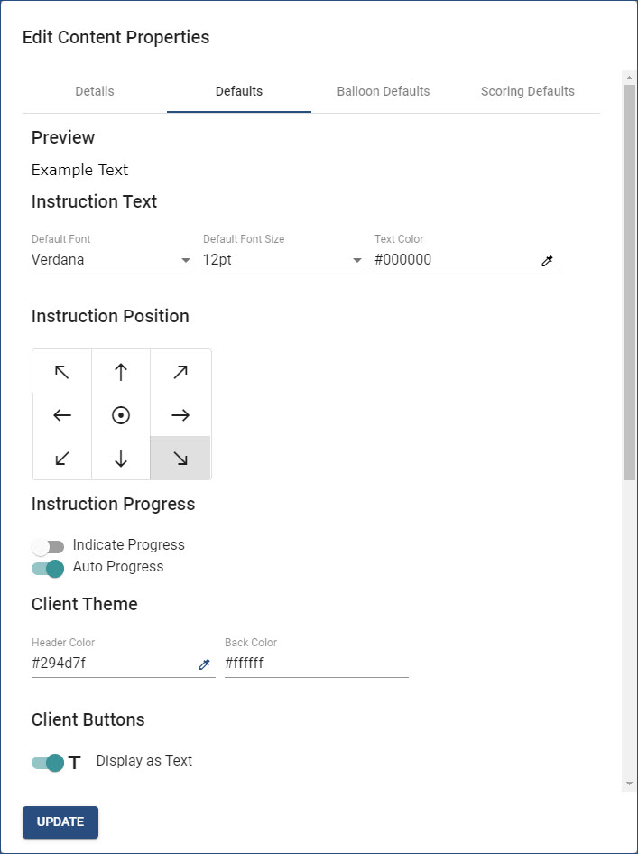
•Preview. Displays a sample of how instruction text will look based on the Instruction Text Settings.
•Instruction Text Settings.
oDefault Font. Click the down arrow under Default Font to select the appropriate font style.
oDefault Font Size. Click the down arrow under Default Font Size to select the appropriate font size.
oText Color. Click the eye-dropper icon to set the text (font) color. (See the Setting Colors topic.)
•Instruction Position. Select the appropriate location for instruction frames to be displayed when content is running. The default location is the lower right corner of the screen. This setting can be changed within individual content files and/or individual instruction frames.
•Instruction Progress. Click the appropriate slider(s) to toggle the setting on/off.
oIndicate Progress. Display a Progress bar when content is running. By default, this setting is turned off (inactive).
oAuto Progress. When content is running, if an instruction frame has captured steps, content will automatically progress to the next frame when the last captured step has been performed. By default, this setting is turned on (active).
•Client Theme. Use these settings to determine the Header bar and Background colors of the instruction frame. Click the eye-dropper icon to set each color. (See the Setting Colors topic.)
•Client Buttons. Use the slider to determine how Progress icons/buttons in the Header bar of the instruction frame will display when content is running. By default, the slider is turned on, which will display Progress buttons as Back (Previous), Next, Exit/Finish/Close, etc. When turned off, Progress icons will display as arrow and X icons.
Important! Clicking outside the Edit Content Properties dialog box before clicking the UPDATE button will close the dialog box WITHOUT saving any changes, in effect, canceling the changes! |