Click the Balloon Defaults tab to set the properties for BalloonTips that may be applied to Lesson (not Assessment) content. Using the graphic for reference, the settings are identified below. (See the Adding BalloonTips topic.)
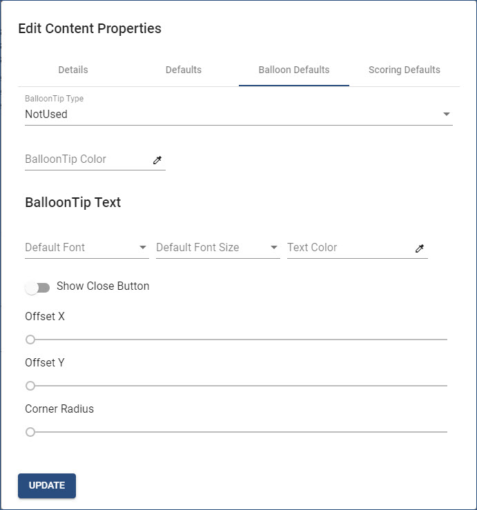
•BalloonTip Type. Click the arrow to select one of five options:
oNotUsed. Choose this option for Assessment content.
oNormal. Choose this option to allow BalloonTips to be displayed in learning content next to the captured control.
oOutline.  Not available at this time.
oFocus. Not available at this time.
oHTML. Choose this option for content that only has one instruction frame with multiple captured steps; where the BalloonTip serves as the instruction.
•BalloonTip Color. Click the eye-dropper icon to set the background color of BalloonTips. (See the Setting Colors topic.)
•BalloonTip Text. Text within BalloonTips will display using the same Default Font, Default Font Size, and Text Color set in the Content Properties Defaults unless changed. If a BalloonTip Color has been set, it is likely the BalloonTip Text Color should be changed.
•Show Close Button. If the HTML BalloonTip Type is selected, click the Show Close Button slider to display a Close button when the last BalloonTip is played.
•Offset X and Offset Y. Not available at this time.
•Corner Radius. Use the slider to change the angle of the BalloonTip corners. Not available at this time.
Important! Clicking outside the Edit Content Properties dialog box before clicking the UPDATE button will close the dialog box WITHOUT saving any changes, in effect, canceling the changes! |