Course and Path Card Images
 Default Library Course and Path Images
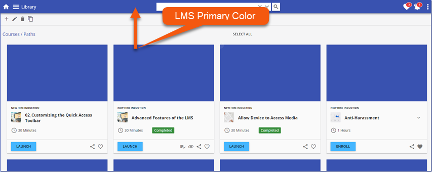
By default, a solid-colored placeholder is globally applied to all Courses/Paths in the Library. The Course and Learning path image placeholder adopts the LMS primary color as defined in Branding.
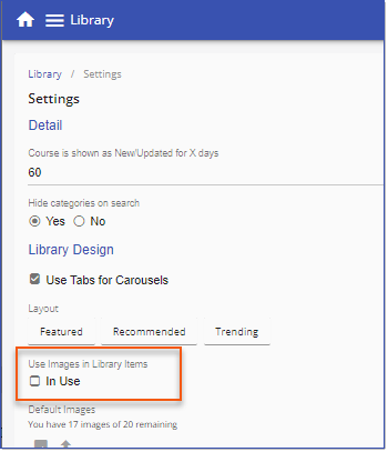
Use Images in Library Items is disabled by default. Once Use Images in Library Items has been enabled, return to the solid-colored placeholders by disabling this setting via Library > 3 dot options > Settings > Library Design > Use Images in Library Items.
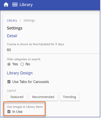
Enable Use Images in Library Items via Library > 3 dot options > Settings > Library Design > Use Images in Library Items.
When Use Images in Library Items is enabled, replace the solid-colored placeholders with up to 20 "default" images to be randomly applied to any Courses/Paths in the Library that do not have a specific image aligned. Choose from Intellek images
|
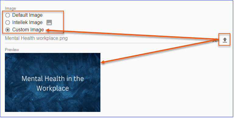
Replace the default Course/Path card images for individual Courses/Paths by navigating to the Library and editing •Default Image is the default images as defined in Library > 3 dot options > Settings > Library Design > Use Images in Library Items. •Intellek Image •Custom Image allows you to upload |
Course and Path Card Design
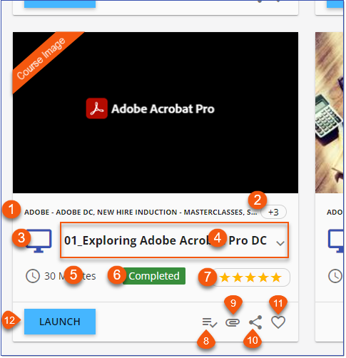
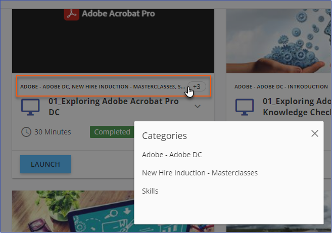
Course cards include the following details. 1.All associated category-subcategory navigation trails display in a comma-separated list. 2.When multiple categories are aligned with a Course, and displaying all exceeds the space available, each category is fully listed in a popup.
3.The Course Delivery image is displayed. 4.The Course title is displayed with an option 5.The expected duration as configured in the course detail is displayed. 6.When you have previously completed a SCORM, AICC or General course, the Completed tag displays. 7.When Rating settings are enabled for Courses and Paths in Library > 3 dot options > Settings, and at least one rating has been been submitted, an average rating scale displays. When clicked, details are displayed. 8.The Prerequisite icon when there are course prerequisites. The requirements are displayed by clicking on the Prerequisite icon. 9.Available course attachments are indicated with the attachments icon. Click an attachment link to open the attachment. 10.The Share option allows users to email and copy the full URL as well as copy a hyperlinked course title for sharing. 11.Add/remove the course to/from your Favorites list. 12.LAUNCH a course or ENROLL to display options for a scheduled course.
|
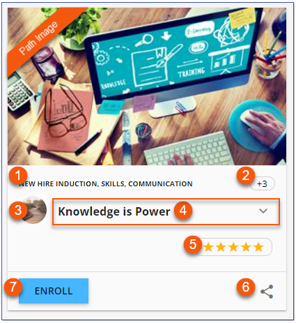
Path cards include the following details: 1.All associated category-subcategory navigation trails display in a comma-separated list. 1.When multiple categories are aligned with a Path, and displaying all exceeds the space available, each category is fully listed in a popup.
2.The Path image from Library > 3 dot options > Settings > Paths is displayed. 3.The Path title is displayed with an option 4.When the Rating settings are activated for Courses and Paths in Library > 3 dot options > Settings, and at least one rating has been been submitted, an average rating scale displays. When clicked, details are displayed. 5.The Share option allows users to email and copy the full URL as well as copy a hyperlinked Path title for sharing. 6.ENROLL in the Path to prompt an option to launch it.
|

1.All associated category-subcategory navigation trails display in a comma-separated list. 2.When multiple categories are aligned with a Course/Path, and displaying all exceeds the space available, each category is fully listed in a popup 3.Course cards will display the Delivery image associated with the Course as defined in Library > 3 dot options > Deliveries. 4.Path Cards will include the Path image as configured in Library > 3 dot options > Settings > Paths. |