The Themes available in the Live Content Studio determine the look and type of Instruction window that will be displayed to end-users when running the content. You can use more than one Theme in a piece of content. The combination and how they are used are based on the requirements for the content and your personal preference.
The Themes can be found in the Main Interface of Live Content Studio and on the Themes tab in the Add/Edit Instruction window.
The Minimal Instruction and Standard Instruction with detached toolbar themes are listed in the Main Interface in the Instructions group on the ribbon. The Minimal Instruction is the default selection and is shown first in the example below. Each provides the option to use an Instruction and detached toolbar while customizing the border color. The Classic Instruction (only accessible from the Add/Edit Instruction window) provides any required toolbar buttons inside the Instruction window. Examples of these Themes with the default settings are shown below:  Minimal Standard Classic |
Choose the Theme that you like the best. You can use this Theme as the basis for creating the opening/closing Instructions for your content. Format the opening/closing Instructions with the attributes that you like and save it to your content development location.
1.Select the Minimal or Standard Theme button on the ribbon. 2.In the Add/Edit Instruction window, click the Options tab. 3.Select the options you require. (See the Theme Tab and Options Tab topics.) 4.Click the Text Instruction tab. 5.Enter any sample text for the opening Instruction. 6.Format the text. 7.Click the New Instruction tab, and then select Text. 8.Enter any sample text for the closing Instruction. 9.Set any Options if different from the opening Instruction. 10.Close the Add/Edit Instruction window. 11.Click Save.
|
The Options applied to these Instructions are shown below:
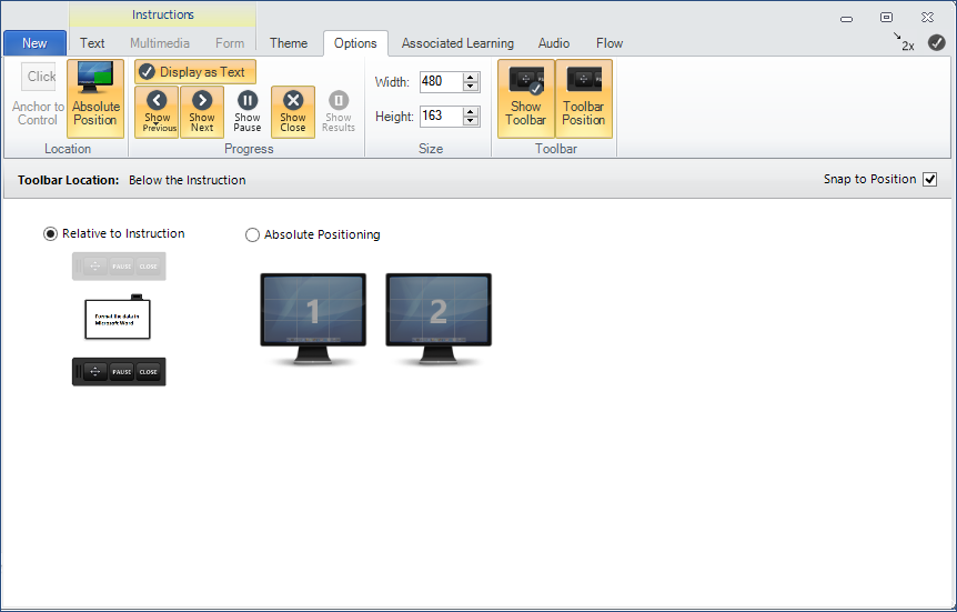
We have chosen to place the detached toolbar below the Instruction. This is achieved by: 1.Clicking the Toolbar Position button on the Options tab. 2.Select the toolbar below the sample Instruction. 3.Once the Toolbar Position has been set, click the Toolbar Position button again to return to the Instruction Locations Options screen.
In the Progress group on the ribbon, we have chosen to include the Show Next, Show Previous, and Close (Exit) buttons to every Instruction. To use words rather than the graphics, click the Display as Text button at the top of the Progress group.
Use the Apply to All Instructions button to apply the selections to all Instructions. |
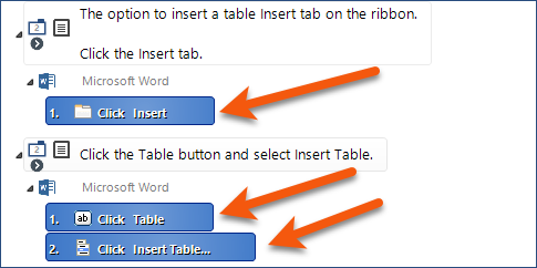
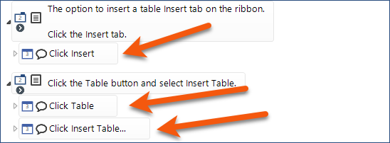
If you are using either the Minimal or Standard Instruction theme, it is suggested that you create your Instructions first, and then capture the steps, if any. If you’d like to add Balloon-tips, remember that it consists of a Standard Instruction plus a Balloon-tip Instruction which points out a location on-screen for a step. Create the Standard Instructions, capture the appropriate steps, and then close the Add/Edit Instruction window. In the Main Interface, expand any Instruction that contains a step, and select the step. (Use Ctrl+Click to select non-contiguous items.)
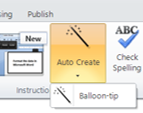
Click AutoCreate > Balloon-tip on the ribbon.
The balloons that will display along with the Standard Instruction are now shown in the example below:
|