The Home Dashboard is typically the initial page all end-users see when they access the LMS. We understand it is important you have the functionality to provide easy access to exactly what they need.
This topic will guide you through configuring what each user can see, based on their role(Security Profile) in the LMS, from Standard User to Event Contact to Company Admin. Choose which cards you’d like to display, and where you’d like them to appear. Before any updates to a role's dashboard is made, each card will be labeled with "None" indicating the cards are still using the Intellek Default setting for that role. To update a role's setting, you must update all 5 cards before clicking SAVE.
•Approval Requests (only useful for roles involve with approvals
•Assignments
•Free Text - this card type can be used multiple times within a single role.
•In Progress
•Learning Record
•Library
•Surveys
•Upcoming Events (we recommend using the double sized card)
•Welcome
News items allow administrators to highlight key information, and guide user activity directly from the Home dashboard. By combining banner visuals, targeted messaging, and group-based relevance, News items help ensure the right users see timely and actionable content. Use News items to promote training, share important announcements, or direct users to relevant content. News items are created and managed via the Communication page.
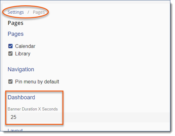
Create a News Item1.From the main menu Navigate to Communication > News 2.Click + Add. 3.Complete the News Details a.Name - Title displayed below the banner. b.Display Sequence - Controls the order of appearance relative to other banners. c.Banner Graphic - Upload an image (recommended size: 874 x 197 px). See LMS Image Guidelines for recommended image size. d.Body or Link - Determine the behaviour of the banner when clicked: decide if you'd like the user to navigate to the News area with aligned Body content or to a URL Link. i.Use Body to display content with the LMS. Use formatting, cc/paste, source code to complete the text users will see. ii.Use Link to direct users to a URL. e.Date Effective From & To - Set start and end dates for the display of the banner (optional). f.Record Status - Set to Active to display the item or Inactive to end the banner display. 4.Click Save. Target Your Audience •Use the Relevance settings to control which users see the News item. •Assign to specific Groups to ensure the message reaches the right audience. Manage Display Settings Administrators can control the banner rotation timing through the LMS Settings: 1.Navigate to Settings > 3-dot option > Pages 2.Set the Banner Duration X Seconds to a value equal to or greater than 12.
|
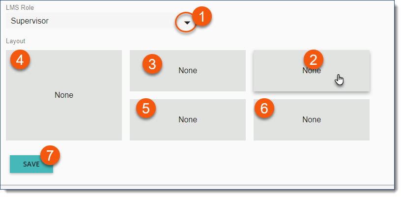
Choose which cards you’d like to display, and where you’d like them to appear. Navigate to the Menu > Settings page. Navigate to the three-dot Options menu, and then select Pages. 1.Select the LMS Role (Security Profile) for the Dashboard you're configuring 2.Click on a card placement 3.Define which type of card to display in the selected location •Approval Requests (only useful for roles involve with approvals •Assignments •Free Text - this card type can be used multiple times within a single role.
•In Progress •Learning Record •Library •Surveys •Upcoming Events (we recommend using the double sized card) •Welcome 4.complete all card 5 configurations if updating from the default "None" setting 5.SAVE
If you don’t make any changes to this page, the layout will remain as is. Unchanged card placeholders are labeled None indicating the default setting. LMS RoleAn individual’s Home Dashboard configuration is dependent on their role in the LMS. Role is defined by the highest Security Profile selection and Event Contact setting in a user account. Select the LMS Role that you’d like to configure.
LayoutWith an LMS Role selected, you can choose the cards you would like to include in your layout.
|
|
|
We provide one double-sized card placeholder on the left side of the dashboard for cards that require more space. Some card types display differently in single and double configurations. Consider the resulting display when designing your layout. See an example below:
 Double-Sized Card
 Single-Sized Card
|