The Form Instruction allows end-users to select from either a pre-defined list of answers or enter free text to answer a question or provide information. The varied uses of a Form Instruction make it somewhat different than the other two available Instruction types (Text or Multimedia). The Form Instruction can be used in conjunction with the other Instruction types to create robust, multi-purpose content.
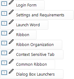
After creating a Form Instruction, when you select another Instruction in the Instruction Panel, the pencil icon will display to the left of the Form Instruction name:
By default, all Form Instructions will display the same name (“Form Instruction”). We suggest that you right-click on the Instruction and rename it to identify the purpose/subject of the Form Instruction. Examples include:
|
To create a Form Instruction, you must be working in the Add/Edit Instruction window. 1.Click the New tab. 2.Select Form.
3.If necessary, modify the Theme, Audio, or Flow tab properties for the Instruction. |
The properties in the Options Tab for Form Instructions may need to be set differently from Text or Multimedia Instructions within the content. Specifically: •Whether or not to include buttons (e.g., Next, Previous, Exit/Close) on the Content Navigation toolbar. They are not required. The Button field on the Form can be used to submit the data to the Results File and move to the next Instruction or form in the content.
•Set the Instruction location to the center of the screen, allowing you the full screen area to size the Instruction without scroll bars. |
Build the form by choosing the appropriate field and dragging it to the Edit Pane.
|
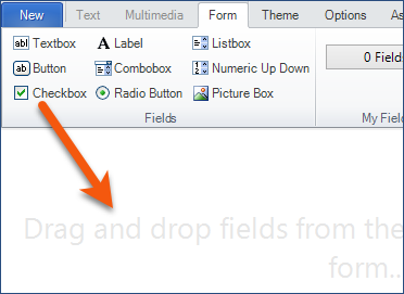
•Textbox – allows input from an end-user. Can be multiline. •Button – presents a standard button that an end-user can click to perform actions. •Checkbox – allows an end-user to mark a statement/answer as correct. Use multiple check boxes to provide a list of choices and allow an end-user to select more than one correct answer. •Label – displays text that cannot be edited by the end-user. •Combobox – displays data in a drop-down list and allows end-users to enter items that do not appear on the list. •Radio Button – allows an end-user to mark a statement/answer as being correct. Radio-buttons are mutually exclusive. Use multiple radio buttons to enforce a single choice from a list of possibilities. •Listbox – allows users to select one or more answers from a predefined list. •Numeric Up Down – displays a list of numbers that an end-user can scroll through and select. •Picture Box – displays graphics in JPEG, PNG, GIF, Bitmap, or icon format. Size the image outside of Live Content Studio. |
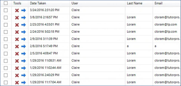
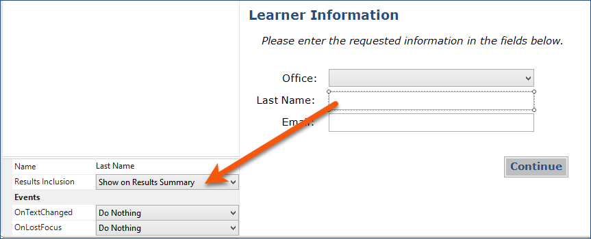
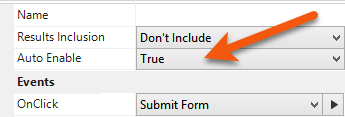
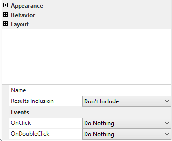
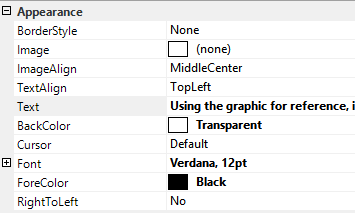
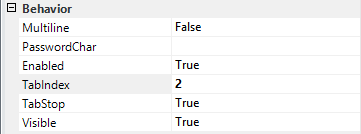
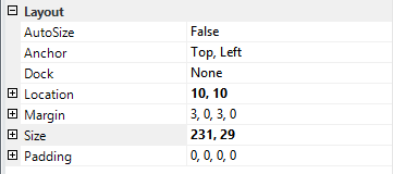
Selecting the appropriate field will impact the way the form functions and defines the Controls that can be used to format the selected field. When a field is selected in the Edit Pane, the Instruction Panel on the left changes to display the Properties for the selected field. In the graphic below, the Properties have been collapsed to show the three areas of formatting: Appearance, Behavior, and Layout. Notice the section at the bottom of the Property Grid. Those options are addressed in the Including Form fields in Results.
|
|
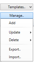
Two Form Templates (Login and Question) are provided in the application. You can use these templates as they are or use them as the basis to create your own templates. Once inserted on the Form, any modifications you make can be saved as a template. You can also set up a Form from scratch and save it for use in other pieces of content. Display the Form on the Form tab. On the ribbon: 1.Click Manage. 2.Click Add. 3.Name the template. 4.Click OK. To use a template, display the form on the Form tab. 1.Click the Templates button on the ribbon. 2.Select a Template from the gallery. |
On the Form tab ribbon, use the Import/Export options on the Manage list.
|
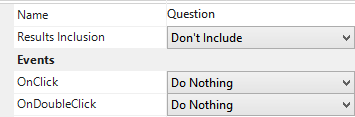
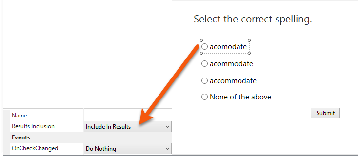
The bottom of the Form Property Grid displays options related to Results and Events.
The Results and Events options displayed depend on the field that is currently selected.
|